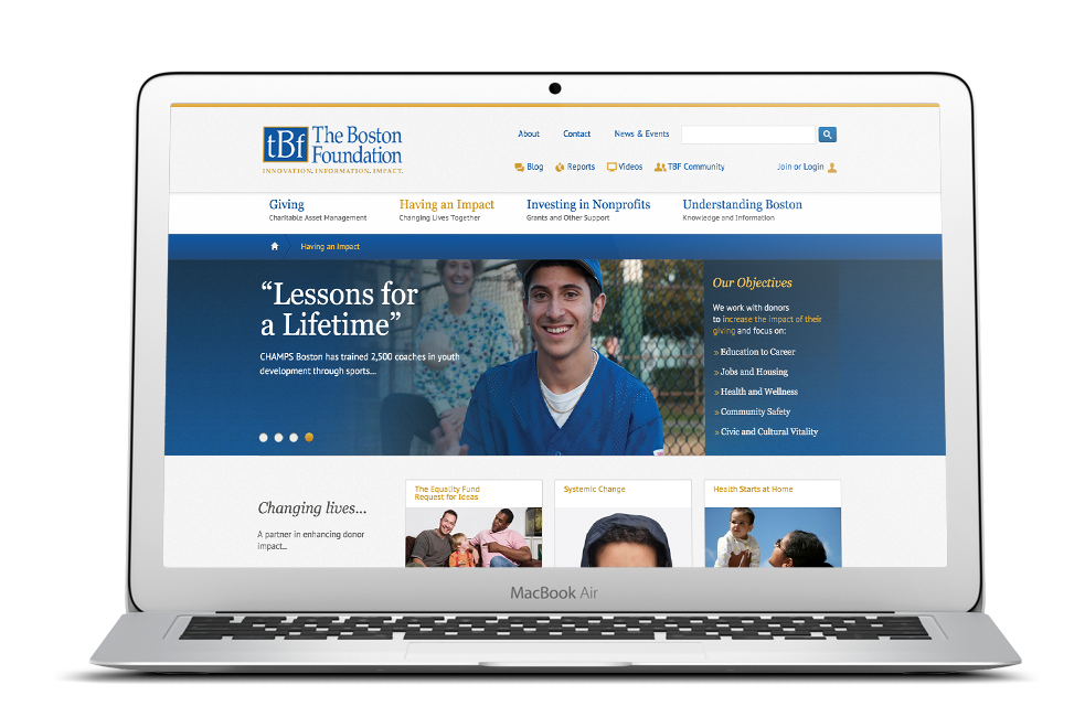
The Boston Foundation was founded in 1915 with a simple but profound mission: Use gifts from generous donors to award grants to nonprofit organizations serving the Greater Boston community.
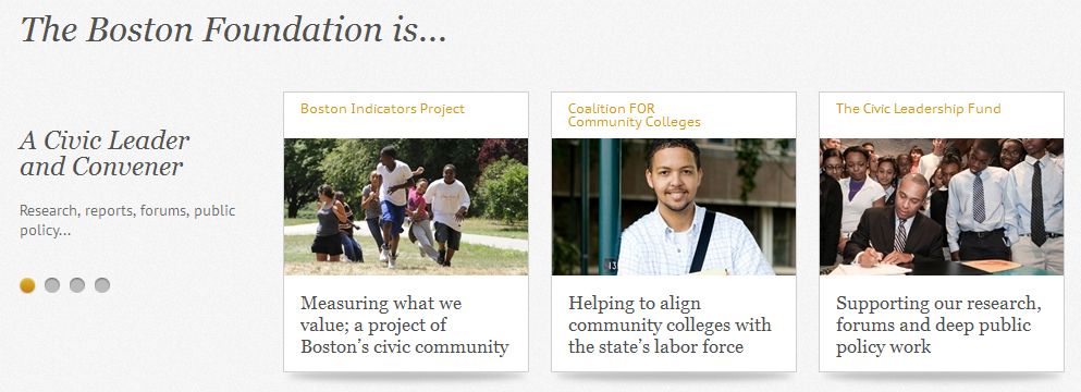
TBF also serves their role as a civic leader by publishing fresh research, convening people to discuss the region’s challenges, and creating powerful agendas for change.
www.thebostonfoundation.org
Sitecore Non-Profit Site of the Year


Project Background
I had previously worked with TBF on their legacy sites, and was asked to help design, architect and develop a new version of their corporate website, www.tbf.org. This new version needed to support a number of critical objectives:
- A new design direction
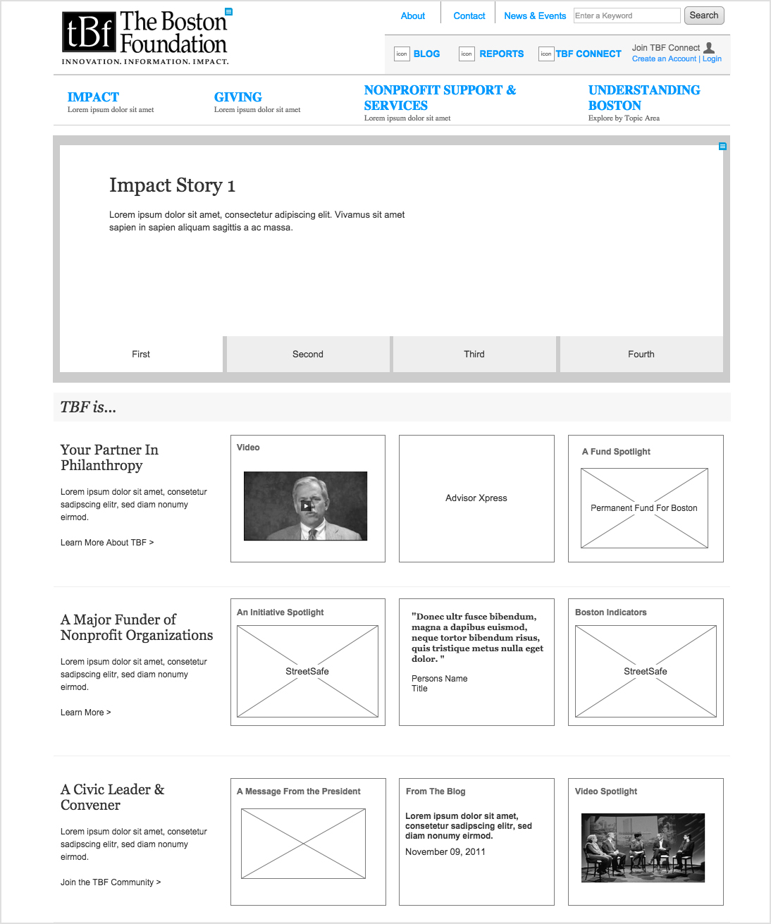
- Improved and simplified navigation
- A new content management system platform, allowing the utmost flexibility for TBF’s web admins
- User dashboards
- New blog integration
- Integration of social media
The Execution:
The list of TBF’s needs was challenging, but delivering flexibility to their web administrators was particularly tricky. Satisfying this request would affect navigation and layout, though the design had to retain its quality and aesthetic no matter how many admins touched and adjusted the site, no matter how often.
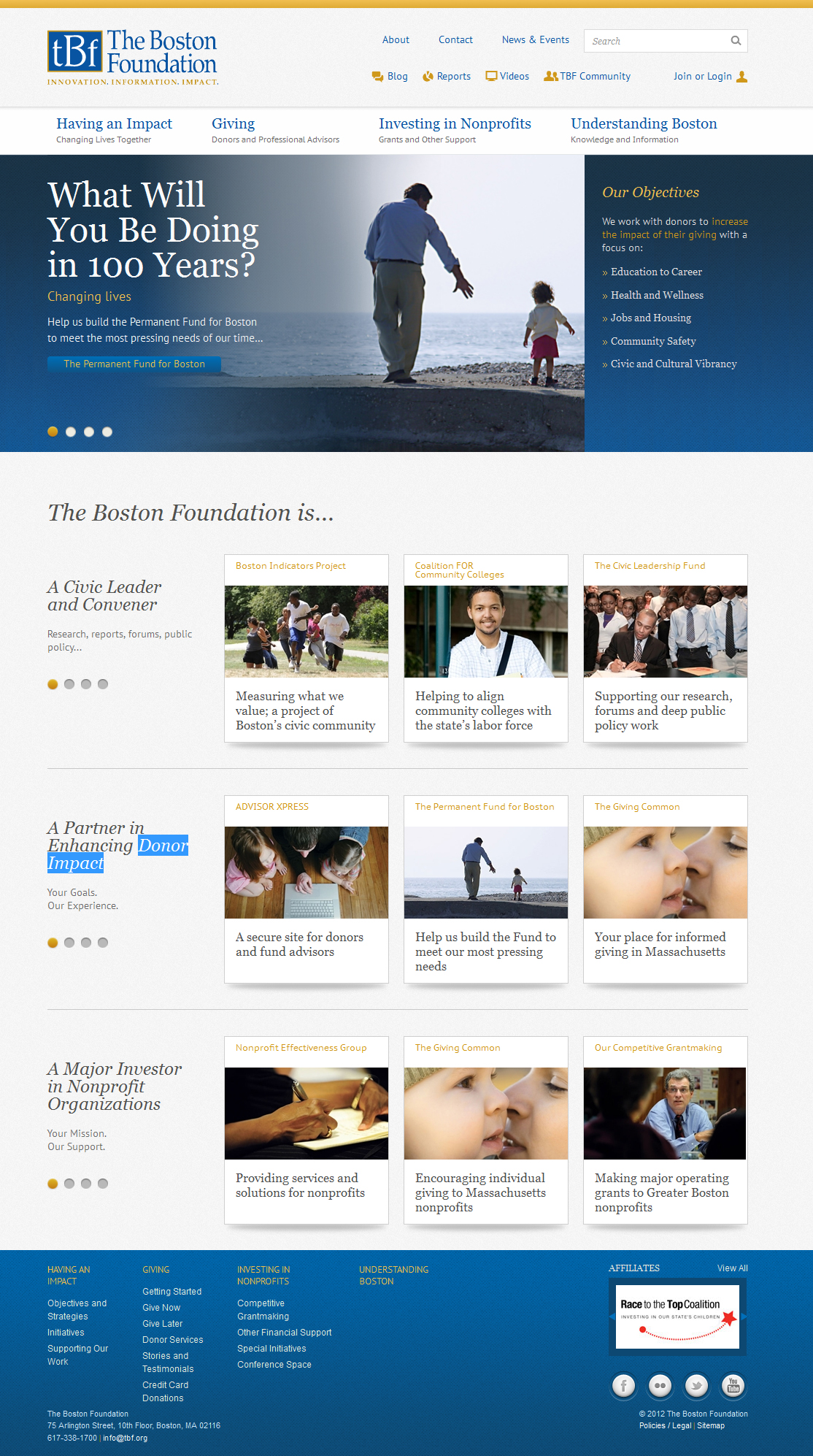
Having worked with TBF in the past, our team already knew the organization had different divisions vying for site visibility and prominence; we determined the design could enable TBF to choose multiple stories to spotlight, and segmented their content into their three distinctive areas: Civic Leadership, Giving, and Grant Making. We also ensured that the three segments, and their missions, were clear to any newer users not already familiar with TBF, helping to broad the scope of interested site visitors.
From a visual perspective, the client wanted to lean heavily on their brand colors, blue and yellow. But I also wanted take advantage of TBF’s amazing image library to make an emotional connection with users, important for a charitable community organization. By making better, more frequent use of images, TBF could tell their story more easily, and could better convey the impact they’ve had in the Boston area.
From a more technical perspective, the site design would be extremely modular, especially to support the CMS and admin demands. By taking this approach, the UI and Engineering teams would not have to code parts of the site multiple times; instead, they could reuse specific modules across site areas. (The header slider above is just one example of the many flexible modules developed for the redesign.) We extended this level of content by creating individual page templates as well.
To further satisfy TBF’s desire for flexibility, we leveraged the 960 grid method, which had the added benefit of saving the engineering team from having to code for a multitude of unique page templates. Functional need meets efficient workflow.
Finally, I recognized that team communication was imperative for this particular project given the scope of technical needs. I worked very closely with a technical analyst (who drafted specifications), a UI production designer and an engineer, to ensure that the design was being developed and fully realized as intended.
Post-pitch:  TBF accepted the redesign, excited by the possibilities. The new tbf.org launched Fall 2012, and won Sitecore Non-Profit Site of the Year.


