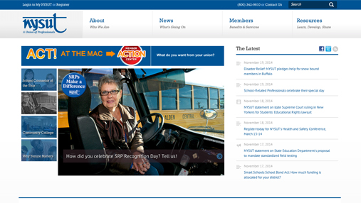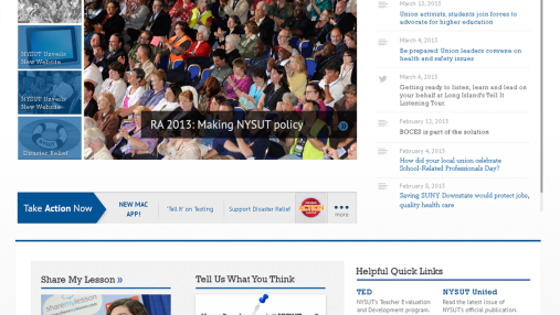
NYSUT is the New York State United Teachers union, a federation of more than 1,200 local unions encompassing over 600,000 members. To accommodate this large, built-in audience, NYSUT needed an easier, more unified way for visitors to get up-to-date news and information — and an easy, clear way to access 12,000+ items, all impeccably organized.

Project Highlights
My role: UX and Design lead
Collaborators: Client, strategy team, development
The approach: As a central part of the Discovery phase, understand the needs of a large variety of departments at NYSUT, to gain stakeholder consensus and satisfy the broadest possible set of requirements
Research highlights: Conducted on-site interviews with the NYSUT team, breaking out learnings by division
Featured deliverables: Clickable prototypes, concepts, sitemap
Considerations and learnings: As NYSUT was an early project to utilize responsive technology, my design team became well-versed on the behavior of certain fonts in the transition from desktop to mobile.
The Outcome
To best serve the sizable NYSUT audience, we plotted out a wholesale conversion to the NYSUT online experience, turning the brand’s static presence into a responsive one. Users can now get timely, usable information regardless of their screen resolution or web device, engaging an even bigger online audience, and keeping them on the site longer.
Improved design and development has resulted in better readability, easier navigational access to content and a refreshed look and feel — important in conveying a feeling of modernism to a regular audience.
Pageviews for membership-related pages: Up 500%
Visitor time spent on site: Up 21%


